The next stage is to create a range of coloured papers with which to design. These are worked at A3 size and will be cut / ripped to make up the wall hanging designs later. My final wall hanging will be worked at an enlarged A1 size
CoIour choices.
During my research I have enjoyed
re-visiting the book Exploring Colour by Julia Caprara where she
suggests that moving around the colour circle from one primary colour
to the next offers harmonious colour combinations whilst moving to
the opposite side offers contrast and vibrancy where the primary hue lies
immediately opposite a secondary colour. I feel this explains the
colour wheel perfectly.
[Google images]
Now I’m looking
back at the colours I selected for my drawings in chapter 1 and how I
might use them in the making up of my decorated papers. I used
predominantly shades of blue from dark through to light with the
addition of green for shades of turquoise. I’ve then added touches
of yellow and then orange as a complimentary colour to add vibrancy.
With reference to
the colour wheel blue it is the primary colour featuring strongly in
this piece of work with the addition of small amounts of yellow in
it’s own right plus addition to the blue to give shades of green,
a secondary colour. Adding green to the blue then gives beautiful
turquoise hues.
The yellow and
orange sit on the wheel harmoniously as they merge with red to form
the orange which, in turn, sits opposite the blue. Red orange also
sits opposite the turquoise. Its all quite magical!
I love working with
colour, it largely comes naturally but I have relished pushing my
boundaries further in my Distant Stitch coursework projects as I have
played around more with contrasts, loving how the colours dance and
pop against each over the water and sky.
Colour symbolism
Colour is used to
symbolise aspects of our everyday lives, our reactions to nature,
events and emotions.
Blue is often
associated with cold, distance and infinity so often affiliated with
the ocean and clear skies whilst green often symbolises peace and
tranquility. Yellow is a colour which brings brightness and cheer,
the colour of the sun. Orange, however, a mix of red and orange
denotes passion, power, fire and warmth seen in the rising or setting
sun. These are also my favourite colours and I love the vibrancy
achieved with the marriage of blue and orange. I associate the
combination with beauty, positivity and optimism which are fitting
with the concept of renewable energy generated by the wind turbines.
I’ve decided to
make a colour chart [above] using my Brusho paints, it turned out to be less
straightforward than I first thought. I’ve focused on blue and
orange as my main colours but became drawn into tints and shades.
Random experiments proved exciting too. I’ve always found working
with colour easy and instinctive but I’m delighted to have this
opportunity to play further.
My chart ranges from
blue through to violet adding in tints and shades.
Decorative papers
I've used a range of paper surfaces that relate to my theme including plain cartridge paper, tissue paper, bubble wrap.
My colours are based around blue, turquoise, orange and yellow including light and dark tones.
The following examples list the media I used:
9.1
From left to right:
a. Tissue paper was randomly pleated and brushed with Brusho inks in aquamarine on one side and and turquoise on the other. This was opened out and allowed to dry before being ironed flat.
A rubbing was then made using a yellow ochre over a shaped rubbing board.
b. Tissue paper randomly pleated horizontally and painted with aquamarine and yellow on one side and turquoise on the other, carefully unfolded, ironed when dry and then painted with diluted PVA to add a sheen.
9.2
From left to right:
a. Cartridge paper randomly sponged with blue/black Brusho paints and allowed to dry. Spiral shapes added using Inktense sticks in darker blue and orange.
b. Tissue paper with candle rubbing over a relief surface [glued down hole punch waste] and two colours of Brusho [blue and orange] added at random.
c. Cartridge paper previously used as backing for tissue paper samples, rubbing made with blue oil paint stick and washed with blue Brusho.
d. Bubble wrap painted at random with orange and yellow ochre acrylics.
e. Tissue paper laid over a rubbing board, silver wax crayon used to create pattern, Washed with blue, turquoise, blue and orange Brusho.

9.3
From left to right:
a. Tissue paper crunched into a ball, backing of cartridge paper covered with PVA onto which the tissue paper smoothed evenly over and flattened with a dry paint brush. Allowed to dry and then a wash of blue Brusho applied, Chalk pastel rubbed over the raised surfaced when dry.
b. Tissue paper laid over a cardboard rubbing board and silver wax crayon used to create a rubbing. Aquamarine and turquoise Brusho sponged the surface over at random.
c. Tissue paper laid over a relief surface [ punch hole waste] and rubbing created using a silver wax crayon. Horizontal strips of light and dark tones of blue Brusho brushed across.
d. Cartridge paper coloured with deep blue and turquoise acrylics and allowed to dry. Over printed with lighter blue acrylic using bubble wrap.
e. Bubble wrap sponged with shades of blue, turquoise and orange acrylic paints at randomly
f. Tissue paper glued to bubble wrap backing and surface rubbed with blue, turquoise and yellow oil paint sticks. Painted with Brusho in turquoise, Aquamarine, blue black.
g. Corrugated card used to create swirls on cartridge paper. When dry more swirls added a pearlised paint.
h. Ochre yellow oil paint stick used to create a rubbing on cartridge paper. Turquoise Brusho sponged over dry surface.
I realise I’ve
produced too many decorated papers but I wanted to experiment. I’ve
recorded each process so I look back for future reference. I’ve
chosen decorative, patterning and textural techniques which will
represent effects seen in water and sky. I don’t as yet have any
ideas about my final design
so I am keeping an open mind.
Designs into full colour
9.4
Original design
I used 3 of my decorated papers.
Base layer 9.2.b – Tissue paper with candle rubbing over a relief surface plus 2 layers Brusho paints [blue and orange].
Middle layer 9.2.d – Strips of bubble wrap painted at random with orange and yellow ochre acrylics.
Top layer 9.2.e – Cartridge paper previously used as backing for tissue paper samples and rubbed with blue oil paint sticks and washed with blue Brusho.
9.4.1
Lines cut in top layer to reveal negative spaces and tissue paper layer below. Curved strips of bubble wrap inserted into the space to add a suggestion of bubbles below the surface plus a flash of a complimentary colour and vibrancy against the blue.
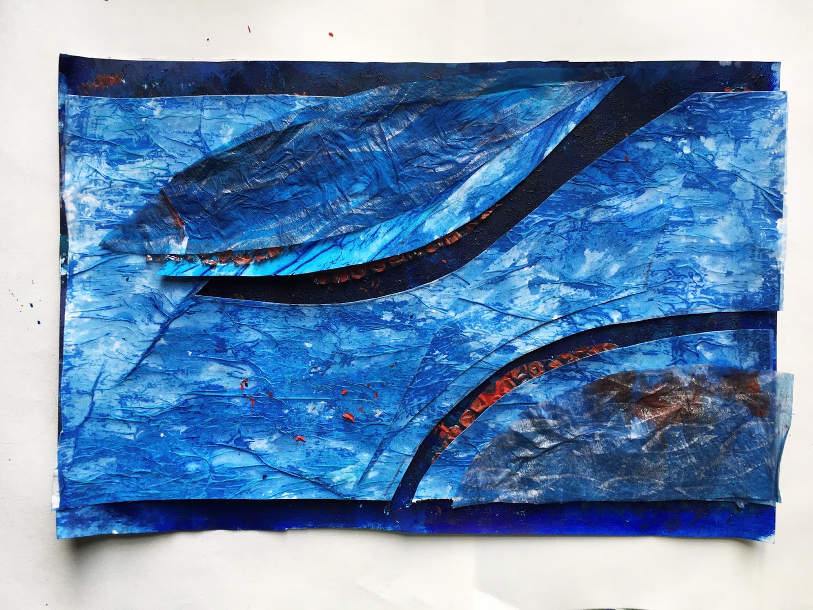
9.4.2
Wider spaces cut from negative spaces and placed to reflect cut lines, to add rhythm and texture.
I’m very pleased with this and loved the coming together of the contrasting colours within the layers. I liked the effect of the horizontal brush strokes on the top layer and the suggestion of depths below. The addition of the painted bubble wrap makes the colours dance and adds rhythm to the ebb and flow of the ‘waves.'
9.5
Original design
I used 3 of my
decorated papers:
Base layer 9.3.d –
Cartridge paper coloured with deep blue and turquoise acrylics, Over
printed with lighter blue acrylic in paler blue using bubble wrap.
Middle layer 9.3.g –
Corrugated card used to create swirls on cartridge paper . More
swirls added in pearlised acrylic paint.
Top layer 9.2.a –
Cartridge paper randomly sponged with blue/black Brusho paints,
spiral shapes added using Inktense sticks in darker blue and orange.
9.5.1
Basic shape cut out
in middle layer to reveal the negative shape and base layer below.
9.5.2
I experimented with
arranging the cut away negative shapes around the basic shape……..
9.5.3
………but then
decided to cut out the negative shapes in a contrasting top layer
and arrange them over the basic shape.
I’m delighted with
this! I love the bubbly textures in the basic layer, the metal
appearance of the ‘turbine’ and the rolling waves of the upper
layer.
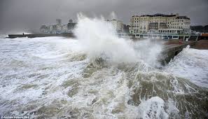
All through the
previous chapters in this module I’ve wanted to represent the
turbine in this way - see image below worked in ch 6:
but I realise that the
final piece has to be non figurative so maybe this is too contrived?
I envisage this worked to the A1 format as a repeated pattern i.e. my A3 repeated x 4 but this wouldn't be the remit - would this be acceptable I wonder? I'd like to see them worked individually and suspended as 4 but represented as an A1 piece.
9.6
Original design
I used 4 of my
decorative papers
Base layer – 9.3.d
- Cartridge paper coloured with deep blue and turquoise acrylics,
Over printed directly with lighter blue acrylic in paler blue using
bubble wrap, I then added some monoprinted textures using bubble wrap
again but in turquoise and orange.
Second layer – 9.3.a - Tissue paper crunched into a ball , cartridge paper covered with PVA onto which the tissue paper is spread and flattened with a dry paint brush, Allowed to dry and wash of blue Brusho applied. Chalk pastel applied to raised surfaces when dry.
Third layer – 9.3.b – Tissue paper laid over a cardboard rubbing board and silver wax crayon used to create a rubbing. . Aqua marine and turquoise Brusho sponged over the surface at random.
Fourth layer – 9.2.d – Bubble wrap painted at random with orange acrylic paint.9.6.1 and 2
Basic shape cut out of second layer to reveal base layer below
9.6.1 and 2
Basic shape cut out of second layer to reveal base layer below
9.6.3
Negative shapes from
second layer placed and arranged to enhance the rolling waves and the
power of the turbines.
Third layer arranged
on top and then curved strips of painted bubble wrap placed to
represent bubbles below the water’s surface.
9.6.4
Further layers of papers from 2nd and 4th layer added to add more movement and drama to the positive spaces.
I can also see this as a repeated pattern of my A3 design to make an A1 wall hanging. I find the rhythm of the design very pleasing. This is a proposal but again, would it be acceptable as it is not sticking to the brief.
In any event this sample 9.6.4 has always been my favourite, it’s representative of the power of the
waves and slicing of the turbine blades as they seemingly harness and replenish
power. I love the sense of drama, rhythm, and movement. I find the
watery effects of the second layer very compelling and feel drawn in
by the atmosphere created.
I'll wait to hear from Sian before I proceed.