Sian suggested some further developments to my samples in this chapter which I have found very useful and helped me think the design through further. I’m particularly interested in finding ways to create a forest floor effect with my leaves and letters and didn’t feel I was quite there but Sian’s ideas gave me the courage to play less safe and take more risks!
Sample 5
Sian suggested I tear away some of the paper whilst leaving some clinging to the lettering which has resulted in a more organic feel
Sample 7
Again Sian suggested I rip back some of the paper to reveal the dyed linen scrim below which gave an aged effect
Sample 8
I loved this sample but didn’t feel the stitching had highlighted the leaves and letters enough but Sian suggested I think in terms of reverse applique and cut around the leaf shapes to outline the American Oak. this was very effective but was tricky as the handmade paper layers were very thick and I couldn’t cut very clearcut edges. If I decide to use this again I’ll use a finer paper. the yellow one works better than the purple [ slightly different leaf shapes ]
And then the embedded leaf and letter silhouettes at the end of the chapter which I experimented with…………
Sian suggested I try adding decorative stitched lines of leaves to an embedded leaf or letter
I chose the sample with the maple leaf first:
Sample 10
And set about adding leaf and letter shapes in such a way to produce interesting linear patterns. I drew it out first
And then added free machined straight stitching stitching:
I lke the fragility of the paper and the debris scattered on the surrounding scrim; the stitching has also highlighted this fragility in places.
I still felt, however that I could take this further. I wanted more of a layered look and more definition. I wondered what would happen if I cut round the image. So I tried cutting round the drawing first and loved it:
I took the plunge and cut! Things started to look exciting when I placed this against a contrasting background:
But I really liked the contrast of the dyed scrim behind it which seemed to give a more autumnal feel and looked fabulous against sample 9 – an adjacent page perhaps?
Finished piece:
I’m very pleased with this and love the beautiful leaf shapes and the negative shapes created by cutting and using reverse applique.
Sample 11
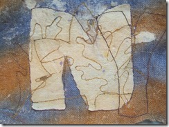
I tried the same idea with the letter N
And added stitching:
Cut around it and completed it:
Very pleased with these and I feel I’ve achieved the layers and texture I was looking for. It’s quite difficult to achieve the fine reverse applique when working with scrim but on the other hand it does give a rustic feel of a forest floor.


You really seem to be on a roll now Carrie with the idea of cutting away. It looks like you have now made this chapter your own and got your own slant on it. Well done!
ReplyDeleteThank you Catherine! Yes, really pleased with the cut away look!
ReplyDelete