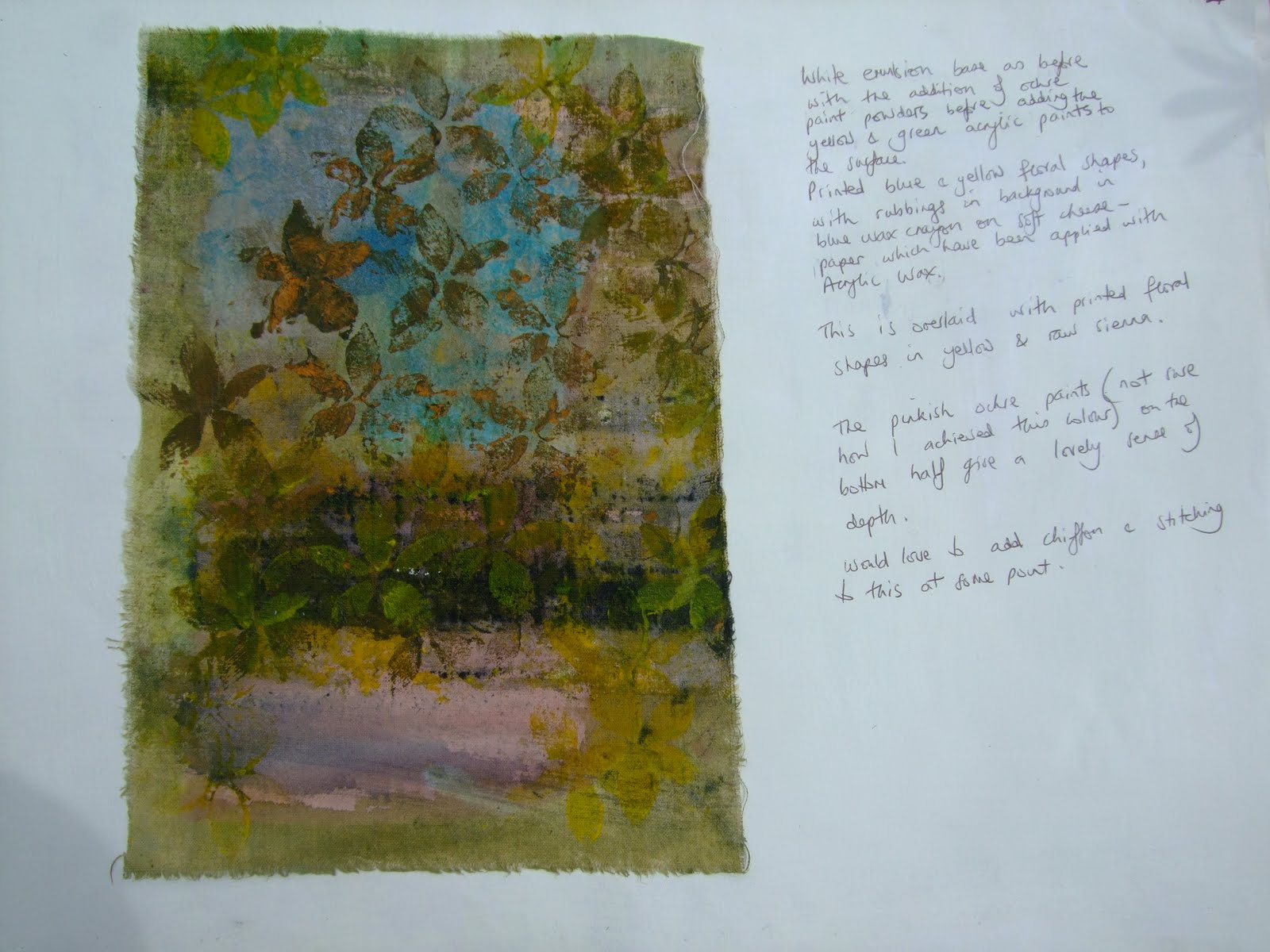
This is the start to my
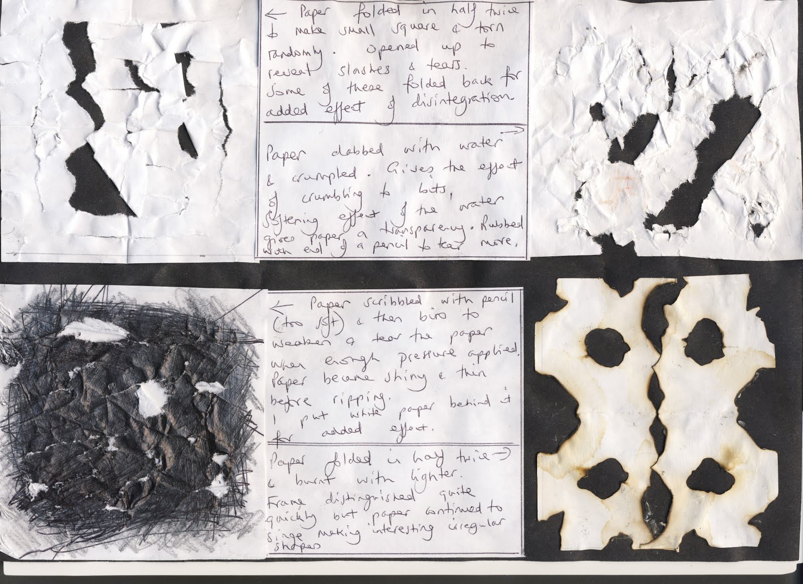
first thoughts paper experiments, I've scanned the pages in this time so have already added some comments but looking at it now I can see a kaleidoscope efect on the hole punched pieces which I hadn't noticed before.

Both the bottom samples give an impression of movement in their disintegration, the one on the left in a sharp arrow-like fashion in both directions and the other in a gentle circular way.

The torn samples here seem static on the page whilst the bottom left glares out - quite aggressive!
The burnt shapes seemed irregular at the time but in fact they were burnt whilst the paper was folded so its not surprising that they seem to dance together proudly when I look at them on the blog. An effective repeated pattern is there - almost as if they are kissing!

The circular cuts are gentle and seem to rotate the paper square, I like the idea of cutting and folding back - it gives a suggestion that there is more to discover and that more disintegration will follow!
My mind keeps going back to the plane tree bark and so I thought I'd try and emulate the shapes by cutting the shapes on the bottom left using both larger cuts and the smaller ones as seen on my photo [see below, this is in ch 9 but I've posted it here too as I refer to it so often].
The tearing and crunching of the newspaper creates some movement within the folds. Crunching and tearing is always , for me, associated with disintegration.

I'm really pleased with this, again tearing [newspaper in this case] but what intrigues me is how the coloured newspaper really seems to capture

some of the texture and colours of the bark in my photo [above], this wasn't intentional!

This piece of paper has been machine stitched bfore being soaked in water and rubbed to give the appearance of disintegration. I used the free embroidery technique with the dog teeth down and an embroidery foot in place, ensuring that every stitch is connected to another to prevent them from unravelling when the paper breaks down. Again I've tried to emulate the plane tree bark.

For these
second thoughts I've used one of my basic folded and cut paper shapes from ch 4. I have chosen to fold and then tear the paper, replacing the torn away shapes afterwards. I felt that tearing would give the roughened effect so often seen in disintegration and in particular with the effects I've noted on the tree bark.
Each sample is folded and torn, each one becoming more complex.
At this stage my work has become disrupted due to kitchen being 'done' and all sorts of stuff being stored in my studio, fetching older son from Uni, younger son's 21st birthday, my dept at work [Safeguarding Children] being Ofsteded - did really well, and going on holiday. All really positive things, a truly extraordinary time but didn't leave much time/energy for C&Gs.
However, I had time to think in quieter moments - mostly about plane trees and their bark and to do a little research. Also I was thrilled to find lots of plane trees in Spain on holiday and so took the opportunity to take photos linking to the theme of disintegration and growth.
First some plane tree facts
taken from http://www.bbc.co.uk/england/sevenwonder
s/london/plane_trees
Their bark is unusual and these trees can be quickly identified by their dappled trunk of various colours - usually buff where bark has just fallen off and in doing so, sheds pollutants that may interfere with air reaching the trunk.This is one the reasons why the tree has thrived in cites during periods of severe pollution

My photos show how the bark of the plane tree could represent disintegration and growth as the trees' cycle moves from winter dormancy through to full leaf with the fascinating process of shedding bark to get rid of damaging pollutants going on in the meantime.
The first, to the left is that of a plane tree in winter in London. Bare branches but beautifully statuesque.

The photos below here show:
Plane trees in full leaf in Mallorca.

The third photo is a close up of the plane tree leaves in Spain, I also have some pressed leaves from the tree near home.

This photo was taken in the early morning outside the cathedral in Sollet, Mallorca. I had crept out to see the dawn and sat for a mom ent in the Placa looking up into the plane trees. Lots of little birds were pecking at the seeds of the fruit which caused many of them

to fall to the gro und, I collected some and brought them home [left]. Of course the ingestion and then discarding of seeds by the birds will ensure propogation.

I was also able to collect fallen bark off the ground which I brought home and mounted onto a piece of brown paper for reference [again I noted the similarity between the photo and newspaper sample above].
I have strong ideas developing as to how I could depict the concept of disintegration and growth using techniques learnt in this module.
I'm not sure that this is the right place to record these thoughts but wanted to ensure I got them down in a safe place whilst I continue with this module.
Anyway it feels good to have them set down here as I set off for the Distant Stitch Summer School tomorrow.

I'm now returning to the module having done lots of work and now ready to upload it onto my blog starting with
the disintegration of a peice of fabric. I've used the same shape as previously folding and cutting the calico from simple through to more complex shapes,
looking at and learning the different ways of fraying the fabric, using the left over threads and snippets and the interaction of positive and negative shapes. Marvellous 


These samples demonstrate ways in which I've chosen to make a shape grow smaller [image on the right]] and then how to make a shape look less solid [left]


Multiplying a shape and making a shape out of several smaller shapes
These exercises below have taken me through the processes of developing a design using one initial shape which is then multiplied and manipulated to form a new shape made from its multiplication, first in paper and then using fabric and stitching.


These samples show the finished stitched design of this exercise.
I wanted to produce a sample with a rhythmic feel as the shape was repeated, making use of both positive and negative spaces creating new shapes inbetween as I worked.
In relation to my resolved design my thoughts have been centred on the Plane tree and the shedding of its bark. This forms the essence of my idea around growth and disintegration - that the bark which holds harmful pollutants falls away enabling the tree to thrive and grow especially well in city centres. I will try to represent this concept in my work using techniques learnt during this module.
Below I've scanned and posted some of the thought processes involved following my personal tutorial with Sian at Urchfont.


This is an initial paper layout , I wanted to make use of both the positive and negative spaces in a rhythmic way which was pleasing to the eye whilst introducing irregularities in the shape which are characteristic of the tree bark. Sian also suggested representing the trunk and branches of the statuesque winter plane tree [see earlier photo]. I like this idea as so much inner growth takes place unseen during this dormant phase. I therefore tried to incorporate this using the spaces which developed through the centre of the image.
To take the design further I started to consider colour and background [see below]. I decided to stick with my red and green colourscheme as they give the idea an earthy feel and alongside that I enjoyed the organic quality of the oiled brown paper. I really wanted to incorporate some of the beautiful leaves and seeds I'd collected and started to think more about my earlier idea of these being within the structure and growth of the tree. They therefore needed to lay under the bark to represent the growth and renewal facilitated by the cycle of the disintegrating and falling bark. The image below shows initial thoughts. I considered applying pieces of bark I'd found but I don't like these finding them misplaced as the piece progressed.


I'd already planned to use painted Bondaweb to apply the leaves as demonstrated earlier
in my little research samples but here I've bonded the leaves over a layer of patches of brown paper treated with either olive oil or leather balsam [the latter shows as the lighter patch in the top right hand corner of the right hand image above] to demonstrate the varied shades of the bark depending on how long ago the bark has been shed. This in turn has been washed with a layer of green ink before the leaves have been fused to the surface with Bondaweb coloured by green acrylic paint. The leaf on the left is already itself in a glorious state of disintegration whilst the others look new and fresh again representing diferent stages of disintegration.


My next consideration was the stitching itself and how I'd do this to best effect.
I changed my mind about the choices I made earlier and decided to use the multi-layered ripple effect for the pieces of bark at the top of the design and then to use the chenille effect on the bottom left to represent The diagram above shows how I wanted to arrange the stitching whilst the other sample is one showing the ripple effect cut around the outside of the stitching.
I needed to try this out as I'd cut away from the inside on my previous sample in ch 9.

This is my resolved design showing the oiled brown paper with leaves fused to the background with the painted Bondaweb. I've used approximately 10 layers of fabrics and tissue paper, some painted/printed for added impact. My basic shape represents the pieces of bark at the top worked in the multicoloured ripple effect which has been cut around the outside of the stitching. I've frayed the edges to add to the impression of disintegration , I love the juxtaposition of the different textures and colours in the frayed edges. The sheer green fabric allows the printing on the fabric under neath to show through which adds to the impression of texture. Too much green, however created an imbalance so I decided to cut the top layer only in parts to create a lighter degree of disintegration whilst revealing the gorgeous red silk underneath. I wanted to use hand stitching [running stitch] in selected places to help highlight shape and colour.
My aim was to use the chenille effect on the bottom left to give way to beautiful textures and fray whilst representing the fragility of the bark edges. I decided not to apply pieces of bark to the fabric itself realising that with a little artistic license it worked better when laid over the exposed background and allowed to 'frame' the fabric pieces. I love the way the colour of the real bark picks up the colour around the edges of the brown paper and the way the ragged stem of the larger leaf is reflected in the texture of the bark to it's left. I've couched the little seeds in place to represent renewal, they didn't show at all well under the Bondaweb but now pick up the colour of the edged of the brown paper beautifully. I feel the concept of representing the winter tree trunk and branches as planned before has got a little lost behind the layers of frayed fabric
although this can still be acknowledged as a subtlety.
My design is bigger than that stipulated in the module handbook but I felt I needed the added size to do the idea justice.
With regard to evaluation I feel that I do this constantly as I work being naturally reflective by nature.To evaluate at this final stage of the first module, however, I would say that I'm very pleased with this and look upon the whole module as a great achievement. I feel the resolved design represents the concept of growth and disintegration through the cycle of the shedding of the bark and the regrowth that continues as a result. A beautiful concept which occurs throughout the world of nature.
It differs from my usual style as I would normally go for something much more decorative and ornate, I don't feel it's particularly beautiful as a whole although the layers and textures in their own right are gorgeous and have produced wonderful effects. The image looks a bit too much like a map of Asia - this made me smile!
It has been a fascinating process through which I've learnt a huge amount about design, composition, texture and the interaction of colour which i can now take forward through to the next module.


