Sunday 23 October 2011

Chapter 2 Tonal columns in stitchery

This chapter has been a challenge and has taken me too long if I’m to keep to my time management plan!!

I love the sense of rhythm which I could achieve with these pieces and the fact that I could see a different pattern from different angles but I found I could only do this in good daylight [even a strong light bulb and anglepoise could not help me quite enough] and  I have unpicked work in samples 2 and 3 as I had miscounted and therefore lost the overall sense of pattern.

The fabric used for sample 2 is worked on a kind of linen/cheesecloth; I’d tried to use a beautiful linen but the natural weave had lots of  irregularities meaning that I ended up with an irregular pattern. I then tried to buy an even weave locally [out of stock] and there was a delay in obtaining it on-line so I plumped for the cheesecloth in desperation to get stitching!

A little frustrating all round but here they are; not my best I feel but I’m very pleased with the last sample.

Tonal column in stitchery

tc 1

tc 2

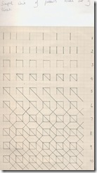
Simple unit of pattern made from straight lines

tc3

tc4

Stitched tonal column based on previous paper design and demonstrating the effect of pattern

tc5

2nd paper design and stitched column demonstrating the effect of varying the spacing of stiches

tc6

3rd paper design and stitched column demonstrating the effect of increasing the thickness of thread

tc7

tc8

Sunday 11 September 2011

Module 2. Chapter 1. The study of tone

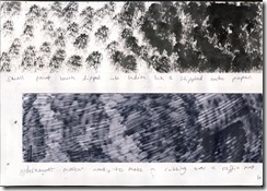
I made a series of 10 tonal columns plus 3 mixed media columns using an assortment of media all in black and white and ranging from Indian Ink, permanent marker, charcoal, torn and cut papers, white acrylic paint etc.

I’ve rolled, scribbled, torn/ cut and stuck with newspaper and photocopies, printed, stippled, made a  rubbing.

1.

Untitled-2

2.

Untitled-3

3.

Untitled-4

4.

Untitled-5

5.

Untitled-6

I’m really pleased with the effect of the roller and black ink  [1] which left a beautiful soft effect which I feel was probably due to the absorbency of the cartridge paper [I remember the effects I noted in the first module when printing on different types of papers]. I also love the fading after several applications.

I’ve also been surprised by the effects of the charcoal [2, 4,] -both black and white -and the stark contrasts they give either when used alone or in addition to other media to deepen/lighten a tone.

Cutting /  tearing papers [ 2, 4 & 5]or printing with card [2] has always intrigued me as results are unpredictable. I especially like the cut pieces of photocopied old manuscript and embroidered bag which seem intensified as a result of the technique.

Mixed media tonal tonal columns

I’ve made 3 of these and had enormous fun as the techniques seemed to flow into each other.
1 & 2

tonal study 8

3.

Untitled-7

I really loved the way the white acrylic paint  applied with the roller created beautiful ripples [1], a very different result from the ink used previously.  I had a lot of fun applying the white tissue paper and then applying black charcoal over it  [1]– it seemed to split and divide – I can really see potential for animal markings in this.

I tried to work a bit more uniformly on [2] by making triangular markings and then breaking them down by adding  a different medium on the top.

I’m very pleased with these especially the effect of white charcoal over the black in the centre of this column.

Again charcoal has been a joy to work with on 3 and I’ve applied it to all the sections here. I was fascinated with the second from the left  - as I rubbed the charcoal over the strips of newspaper it didn’t reach the base paper underneath which resulted in a fabulous contrast.  I also love the effect of the white charcoal over the torn white tissue paper – grainy and delicate.

Sunday 4 September 2011

Study three artists

Sian has asked us to study three artists: Herta Puls, kadinsky and another of our choice who uses any of the techniques and methods included in this first module.

In addition to the information she has given us regarding Herta Puls a textile artist and author of the book entitled The Art of Cutwork and Applique Historic, Modern and Kuna Indian, Sian has asked us to find:

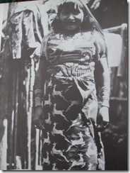
1. An image of the Mola embroidery of the Kuna Indians of Panama [both photos are taken from the book mentioned above:

DSCF2093

I love this photo of a Kuna woman wearing her Mola blouse

DSCF2094

This is a picture of a ‘dog mola’ from Achutupo, San Blas

2. An illustration of Kandinski’s work to show he used shapes  to create create movement and depth in his work.

kandinsky.comp-8

This example shows Kadinski’s use of star and cross shapes in this abstract painting

Composition VIII
1923 (140 Kb); Oil on canvas, 140 x 201 cm (55 1/8 x 79 1/8 in); Solomon R. Guggenheim Museum, New York . Source: http://www.ibiblio.org/wm/paint/auth/kandinsky/

And finally The artist  of my choice is Karina Thompson

 top_banner

dark_grey_day

KandSWG

I met Karina whilst she demonstrated her work at Art in Action a few years ago. She was fascinating to talk to and I visited her many times as my husband was demonstrating in the Illustrator’s tent and I spent most of my time switching between the Illustrators and the textile artists. She was producing beautiful and huge pieces of work using the slashing technique.

This is her entry on her website:

file:///C:/Users/Oli/Desktop/Mum%27s%20Files/distant%20stitch/technique%20slashing%20karina.htm

Slashing is a process that involves layering up fabric, stitching usually in parallel channels and then cutting through to the base layer. This can then be brushed to fray it, exposing the layers below and producing velvet like texture. Further embellishment might take the form of additional stitching or the bonding of plastics or metal foil onto the surface. It is both delicate and robust with intricate colour mixes depending on the fabrics used. It is also stable and surprisingly hardwearing. This technique leads itself to large scale work with the freedom to make dramatic compositional statements as well as subtle colour and textural details.

“I like the intricate and diverse textures that can be built up in this way using straightforward textile processes.”

A recent development has seen the innovative use of digitally programmed stitch to embellish a surface.  This technique allows pinpoint precision of both placement and the nature of the embroidery.  Karina has begun to experiment using this process using medical data for a series of commissions for the Centre for Clinical Haematology, University Hospital Birmingham.

I’ve now completed the first module – a great feeling!

Onward then as I wait for the second module to arrive, perhaps a little of the sketchbook challenge………

Wednesday 31 August 2011

Composite sheet for module 1

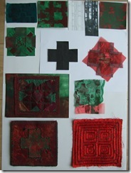
I’ve decided to do two composite sheets because two shapes seemed to be developing all the way through and both sets seemed to be important to the final resolved piece.DSCF2087

Having decided to concentrate on the cross shape this set of samples takes me from the initial photograph I took which inspired me [a metal gate] though to the line drawing, printed papers and fabrics and then paper shapes and layered paper /fabric shapes  this one with a leaf trapped between layers of net. Next came the printed Bondaweb fused onto sheer fabric.

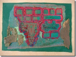
The complex , insertion stitch [with the simple counterchange]  and reverse applique samples all led me to my final resolved sample.

DSCF2090

This second composite sheet demonstrates how the slight variation of the cross shape took me on a similar journey.


DSCF1575

It was this photograph of the plane tree bark taken very late on in the module, however, which set me on my final course to my resolved sample.DSCF2036

I’ve put this here because the work I did for my resolved piece is on my July entry – I’d started it and entered work to date on my blog before I went to Summer School and then edited the same  July entry to complete it which meant that the remainder never seemed to come up as new work on my blog.

I’m really pleased to have completed the journey, it’ll be framed very soon.

Tuesday 23 August 2011

more sketchbook challenge

DSCF2084

More carbon copies!

This is my Dad’s chair

DSCF2083

………. and the carbon copy.

Loving the Windows Live Writer. Stress free!

Monday 22 August 2011

summer sketchbook challenge

DSCF1957

16th July First entry, page stained with tea with simple line drawing. i chose a dandelion leaf.

DSCF1958

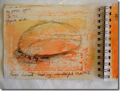
17th July Pebble from beach [pencil /edding pen]

DSCF1959

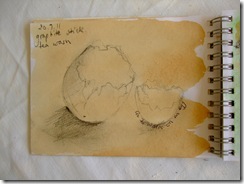
20th July Egg shell [graphite stick]

DSCF2040

20th July Green ink over tea wash + graphite stick

DSCF1962

20th July. Printing ink brushed over torn money off voucher. Soft pencil drawing at top

DSCF1961

Print from previous page left b’ful marks on opposite page

DSCF2038

23.7.11 Pebble. Trying out shadows and contrasts [ sunny today]. A bit smudgy!                                                                                                                                                                       

DSCF2050DSCF2048

25th July. First attempt at drawing marks inside a shape. Really hard and not much patience after long day at work!

Second go much better the following day.

DSCF2041

26th July My team won The Team of the Year award at work so I tore up the programme and drew the stars. I drew the outlines of the stars first but having coloured them in I feel the  outline only worked better

DSCF2044

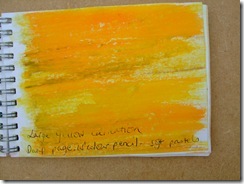
27th July Mixing colour study. Yellow carnation. Damp page, watercolour pencils and soft pastels

DSCF2043

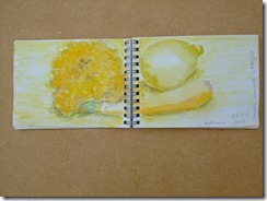
28th July. Watercolour pencil background with w’colour  and pencil  marigold, courgette and lemon. Love the fruit and veg but lost it a bit with the flower! B

DSCF2045

30th July Watercolour pencils. Colouring in

DSCF2046

30th July Sian suggested we use felt tip pen and biro to scribble our colours. All my felt tips dried up so I’ve had a go with oil pastels, what was left of felt tip and biro.

DSCF2049

30th July. More scribbling and blocks of colour.

DSCF2052

4th August.  Using cut magazine papers and snippets of fabricto portray the colours in my orange.

DSCF2053

And more………

DSCF2054

5th August. Scratching into different media

DSCF2055

5th August. Watercolour  with scratchings of my begonia. Gorgeous colours

DSCF2056

6th August. Scratching before painting

DSCF2057

6th August Scraping after painting

DSCF2058

6th August. Wax resist plus green ink; then scraped and scratched

DSCF2059

6th August.Wax crayon, green ink and watercolour; then scraped and scratched

DSCF2061

6th August. Different methods of sgraffito.


DSCF2062

6th August. Sgraffito – oil pastels plus watercolour pencil then pastel. shrub in the garden festooned with berries. I used a view finder to ‘frame’ my image before starting to draw and stuck it on my window frame.

DSCF2075

18th August. Perspective exercise of my mum’s sewing table

DSCF2078

18th August. Pots on my mum’s patio. Carbon copy technique

DSCF2073

18th August. Two for the price of one!

DSCF2076

19th August. My great grannie’s wooden chair. carbon copy technique

DSCF2077

19th August. Two for the price of one.

DSCF2080

19th August. Ghostly imprint!