Friday, 1 July 2011

Chapter 11. Resolved sample - growth and disintegration

This is the start to my first thoughts paper experiments, I've scanned the pages in this time so have already added some comments but looking at it now I can see a kaleidoscope efect on the hole punched pieces which I hadn't noticed before.

Both the bottom samples give an impression of movement in their disintegration, the one on the left in a sharp arrow-like fashion in both directions and the other in a gentle circular way.
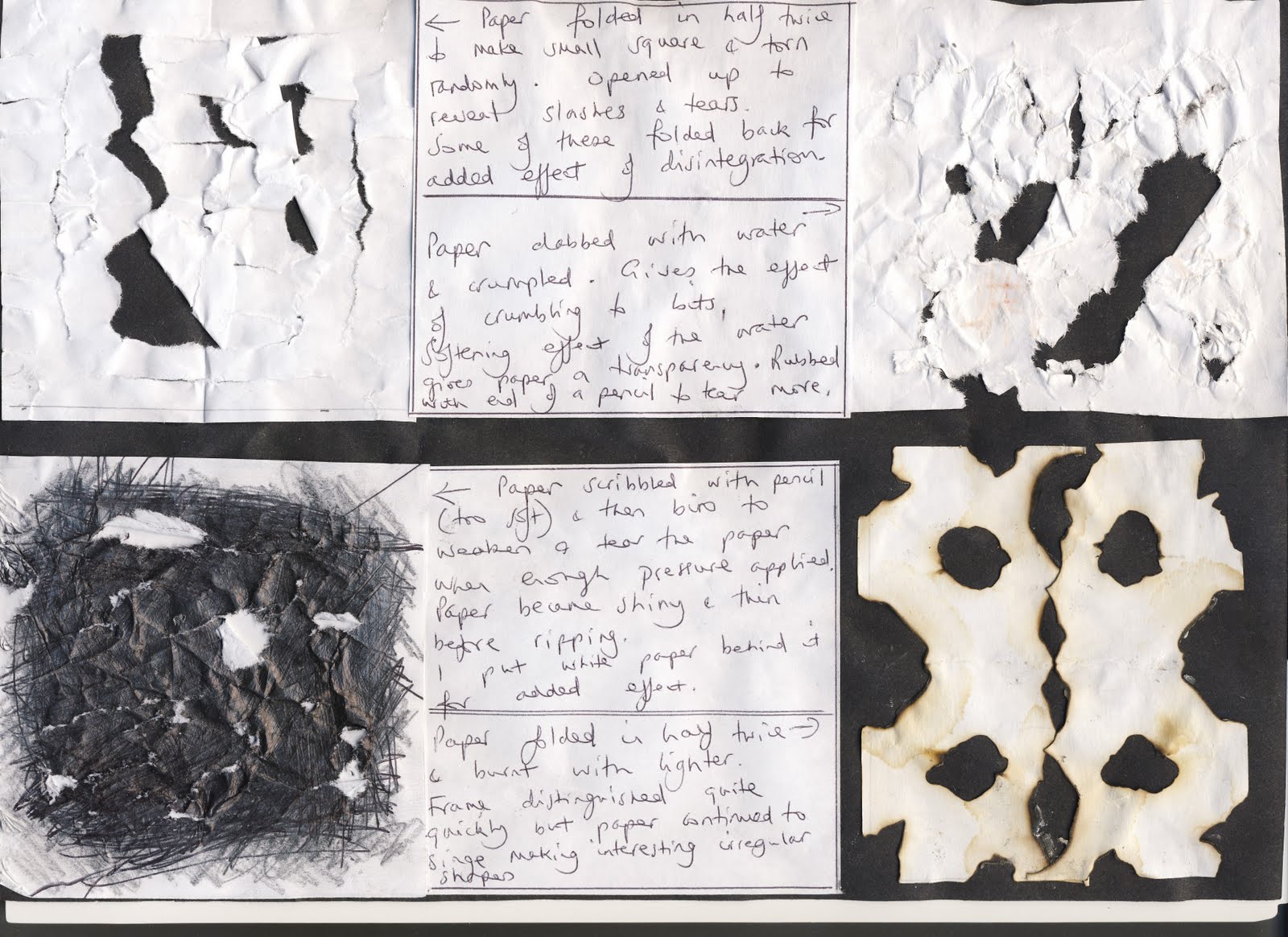


The torn samples here seem static on the page whilst the bottom left glares out - quite aggressive!
The burnt shapes seemed irregular at the time but in fact they were burnt whilst the paper was folded so its not surprising that they seem to dance together proudly when I look at them on the blog. An effective repeated pattern is there - almost as if they are kissing!


The circular cuts are gentle and seem to rotate the paper square, I like the idea of cutting and folding back - it gives a suggestion that there is more to discover and that more disintegration will follow!
My mind keeps going back to the plane tree bark and so I thought I'd try and emulate the shapes by cutting the shapes on the bottom left using both larger cuts and the smaller ones as seen on my photo [see below, this is in ch 9 but I've posted it here too as I refer to it so often].
The tearing and crunching of the newspaper creates some movement within the folds. Crunching and tearing is always , for me, associated with disintegration.

I'm really pleased with this, again tearing [newspaper in this case] but what intrigues me is how the coloured newspaper really seems to capture some of the texture and colours of the bark in my photo [above], this wasn't intentional!


This piece of paper has been machine stitched bfore being soaked in water and rubbed to give the appearance of disintegration. I used the free embroidery technique with the dog teeth down and an embroidery foot in place, ensuring that every stitch is connected to another to prevent them from unravelling when the paper breaks down. Again I've tried to emulate the plane tree bark.


For these second thoughts I've used one of my basic folded and cut paper shapes from ch 4. I have chosen to fold and then tear the paper, replacing the torn away shapes afterwards. I felt that tearing would give the roughened effect so often seen in disintegration and in particular with the effects I've noted on the tree bark.
Each sample is folded and torn, each one becoming more complex.

At this stage my work has become disrupted due to kitchen being 'done' and all sorts of stuff being stored in my studio, fetching older son from Uni, younger son's 21st birthday, my dept at work [Safeguarding Children] being Ofsteded - did really well, and going on holiday. All really positive things, a truly extraordinary time but didn't leave much time/energy for C&Gs.

However, I had time to think in quieter moments - mostly about plane trees and their bark and to do a little research. Also I was thrilled to find lots of plane trees in Spain on holiday and so took the opportunity to take photos linking to the theme of disintegration and growth.

First some plane tree facts

taken from http://www.bbc.co.uk/england/sevenwonder

s/london/plane_trees

Their bark is unusual and these trees can be quickly identified by their dappled trunk of various colours - usually buff where bark has just fallen off and in doing so, sheds pollutants that may interfere with air reaching the trunk.This is one the reasons why the tree has thrived in cites during periods of severe pollution

My photos show how the bark of the plane tree could represent disintegration and growth as the trees' cycle moves from winter dormancy through to full leaf with the fascinating process of shedding bark to get rid of damaging pollutants going on in the meantime.

The first, to the left is that of a plane tree in winter in London. Bare branches but beautifully statuesque.


The photos below here show:
Plane trees in full leaf in Mallorca.


The third photo is a close up of the plane tree leaves in Spain, I also have some pressed leaves from the tree near home.


This photo was taken in the early morning outside the cathedral in Sollet, Mallorca. I had crept out to see the dawn and sat for a mom ent in the Placa looking up into the plane trees. Lots of little birds were pecking at the seeds of the fruit which caused many of them to fall to the gro und, I collected some and brought them home [left]. Of course the ingestion and then discarding of seeds by the birds will ensure propogation.


I was also able to collect fallen bark off the ground which I brought home and mounted onto a piece of brown paper for reference [again I noted the similarity between the photo and newspaper sample above].


I have strong ideas developing as to how I could depict the concept of disintegration and growth using techniques learnt in this module.
I'm not sure that this is the right place to record these thoughts but wanted to ensure I got them down in a safe place whilst I continue with this module.
Anyway it feels good to have them set down here as I set off for the Distant Stitch Summer School tomorrow.


I'm now returning to the module having done lots of work and now ready to upload it onto my blog starting with the disintegration of a peice of fabric. I've used the same shape as previously folding and cutting the calico from simple through to more complex shapes, looking at and learning the different ways of fraying the fabric, using the left over threads and snippets and the interaction of positive and negative shapes. Marvellous


These samples demonstrate ways in which I've chosen to make a shape grow smaller [image on the right]] and then how to make a shape look less solid [left]


Multiplying a shape and making a shape out of several smaller shapes

These exercises below have taken me through the processes of developing a design using one initial shape which is then multiplied and manipulated to form a new shape made from its multiplication, first in paper and then using fabric and stitching.


These samples show the finished stitched design of this exercise.

I wanted to produce a sample with a rhythmic feel as the shape was repeated, making use of both positive and negative spaces creating new shapes inbetween as I worked.


In relation to my resolved design my thoughts have been centred on the Plane tree and the shedding of its bark. This forms the essence of my idea around growth and disintegration - that the bark which holds harmful pollutants falls away enabling the tree to thrive and grow especially well in city centres. I will try to represent this concept in my work using techniques learnt during this module.

Below I've scanned and posted some of the thought processes involved following my personal tutorial with Sian at Urchfont.


This is an initial paper layout , I wanted to make use of both the positive and negative spaces in a rhythmic way which was pleasing to the eye whilst introducing irregularities in the shape which are characteristic of the tree bark. Sian also suggested representing the trunk and branches of the statuesque winter plane tree [see earlier photo]. I like this idea as so much inner growth takes place unseen during this dormant phase. I therefore tried to incorporate this using the spaces which developed through the centre of the image.

To take the design further I started to consider colour and background [see below]. I decided to stick with my red and green colourscheme as they give the idea an earthy feel and alongside that I enjoyed the organic quality of the oiled brown paper. I really wanted to incorporate some of the beautiful leaves and seeds I'd collected and started to think more about my earlier idea of these being within the structure and growth of the tree. They therefore needed to lay under the bark to represent the growth and renewal facilitated by the cycle of the disintegrating and falling bark. The image below shows initial thoughts. I considered applying pieces of bark I'd found but I don't like these finding them misplaced as the piece progressed.


I'd already planned to use painted Bondaweb to apply the leaves as demonstrated earlier
in my little research samples but here I've bonded the leaves over a layer of patches of brown paper treated with either olive oil or leather balsam [the latter shows as the lighter patch in the top right hand corner of the right hand image above] to demonstrate the varied shades of the bark depending on how long ago the bark has been shed. This in turn has been washed with a layer of green ink before the leaves have been fused to the surface with Bondaweb coloured by green acrylic paint. The leaf on the left is already itself in a glorious state of disintegration whilst the others look new and fresh again representing diferent stages of disintegration.


My next consideration was the stitching itself and how I'd do this to best effect.
I changed my mind about the choices I made earlier and decided to use the multi-layered ripple effect for the pieces of bark at the top of the design and then to use the chenille effect on the bottom left to represent The diagram above shows how I wanted to arrange the stitching whilst the other sample is one showing the ripple effect cut around the outside of the stitching.
I needed to try this out as I'd cut away from the inside on my previous sample in ch 9.

This is my resolved design showing the oiled brown paper with leaves fused to the background with the painted Bondaweb. I've used approximately 10 layers of fabrics and tissue paper, some painted/printed for added impact. My basic shape represents the pieces of bark at the top worked in the multicoloured ripple effect which has been cut around the outside of the stitching. I've frayed the edges to add to the impression of disintegration , I love the juxtaposition of the different textures and colours in the frayed edges. The sheer green fabric allows the printing on the fabric under neath to show through which adds to the impression of texture. Too much green, however created an imbalance so I decided to cut the top layer only in parts to create a lighter degree of disintegration whilst revealing the gorgeous red silk underneath. I wanted to use hand stitching [running stitch] in selected places to help highlight shape and colour.
My aim was to use the chenille effect on the bottom left to give way to beautiful textures and fray whilst representing the fragility of the bark edges. I decided not to apply pieces of bark to the fabric itself realising that with a little artistic license it worked better when laid over the exposed background and allowed to 'frame' the fabric pieces. I love the way the colour of the real bark picks up the colour around the edges of the brown paper and the way the ragged stem of the larger leaf is reflected in the texture of the bark to it's left. I've couched the little seeds in place to represent renewal, they didn't show at all well under the Bondaweb but now pick up the colour of the edged of the brown paper beautifully. I feel the concept of representing the winter tree trunk and branches as planned before has got a little lost behind the layers of frayed fabric
although this can still be acknowledged as a subtlety.
My design is bigger than that stipulated in the module handbook but I felt I needed the added size to do the idea justice.

With regard to evaluation I feel that I do this constantly as I work being naturally reflective by nature.To evaluate at this final stage of the first module, however, I would say that I'm very pleased with this and look upon the whole module as a great achievement. I feel the resolved design represents the concept of growth and disintegration through the cycle of the shedding of the bark and the regrowth that continues as a result. A beautiful concept which occurs throughout the world of nature.
It differs from my usual style as I would normally go for something much more decorative and ornate, I don't feel it's particularly beautiful as a whole although the layers and textures in their own right are gorgeous and have produced wonderful effects. The image looks a bit too much like a map of Asia - this made me smile!
It has been a fascinating process through which I've learnt a huge amount about design, composition, texture and the interaction of colour which i can now take forward through to the next module.

Monday, 16 May 2011

Chapter 10 Inlay Applique

Insertion stitch sample

This demonstrates the workings of various insertion stitches.

I’ve taken a piece of green commercially bought felt and decorated it with various mohair fibres using fusible web before cutting it into strips and then re-joining it with the following insertion stitches shown from top to bottom:

Basic simple insertion stitch

Knotted buttonhole stitch

Laced insertion stitch

Twisted insertion stitch

Plaited insertion stitch

Herringbone and knotted insertion stitch

Machine stitched 3-step zig-zag [see smaller sample which shows various stitches]

All of these were worked with a graph paper backing to support the fabrics and enable me to keep the gaps in place with the exception of the last worked on the machine.

I’ve documented all my workings and techniques/sources of information in my log book.

This technique is new to me and I was pleased with the effects I achieved, especially the beaded stitch as I love the jewel like finish it gives, and the beautiful effect of the complex plaited stitch [I love to adorn my work in this way]. I can see potential for all sorts of projects such as books, waistcoats, belts, cuffs not only because there is an added flexibility but also the patchwork/ motif effects for anything worked in ‘a block’.


Simple Counterchange Sample 1

I took 2 pieces of commercially bought felt [one red and the other a contrasting green] and decorated them with various threads mainly mohair, silk fray and snippets of fabric all applied with a fusible web. I decided not to overlay them with a sheer fabric as that seemed to mask the gorgeous patterns made by the threads.

I then drew a simple cross shape on the back of the felt pieces before cutting them out and counterchanging them.

I couldn’t resist using the beaded insertion stitch to secure the inserts. The shapes fitted snugly initially but I had to trim them carefully to allow for the beaded stitching.

I was a little concerned that I’d used too many contrasting fibres and snippets to decorate the felt pieces resulting in insufficient contrast but on completion I can appreciate how the warmth of the red comes forward whilst the cool of the green recedes thus giving the contrast required. Meanwhile the applied threads seem to dance with each other taking the eye back and forth between the two felt pieces.

I used green beads to go with the green insert and red beads with the red to help bring out the effect of the contrast and matched up the colour of the insert with the blanket stitching around the edges.

I’d love to make a wall hanging or even curtains with this technique [time please!!] or perhaps a throw or table cover.

Counterchange Sample 2

I had fun with this!

The photos for this demonstrate the stages in which I worked.

Firstly I took sample’ i’ on my Colour Design Sheet C and then made a paper template on a piece of graph paper [very grubby and has obviously been in my cupboard for much too long!]

I then took the template and used it to make 4 quarters in different coloured felt all decorated in different ways:

· Red strips of fabric bonded onto green felt,

· green strips of fabric/net/ribbon bonded onto red felt,

· red fabric adorned with green fibres and snippets which in turn has been bonded to green felt and finally

· a piece of green fabric adorned with red fibres fused to a piece of red felt.

I then moved these around in a rotational swap to make my counterchange design and tacked them onto a piece of graph paper as before

I decided on a laced insertion stitch using a green braid edging stitch [similar to blanket stitch but with a twist www.ziva-needlepoint-designs.com] and because I wanted to use both colours in the insertion stitch to keep up the busy feel of the overall design I used red thread for the lacing

I had used a scrap of green ribbon in the decoration of the green fabric piece and decided to include the remaining bit to lace the stitches around the square centre for emphasis

The outside edges of my final square piece aren’t very even and this would pose a problem if I needed to join more of them together. This is a learning point and more care needs to be taken next time!

Interchange Sample 3

I took me a while to get my head round this!

Using paper first I took two different cross shapes and then took one other cross shape and cut it from the former two [positive shape = the inside cross. The negative shape is formed from the pieces that surround the inside cross

I then transferred my two different cross shapes onto fabric by tracing the shapes onto the paper backing of some fusible web, ironed them onto fabric and cut them out before fusing these onto a square of felt. These were pieces of decorated fabric I’d made a while ago and so probably seem a bit random, the lighter red one has a leaf fused underneath the sheer fabric covering and although this is lost when the new shape is cut it gives a lovely contrast and glowing effect .

I then used my paper templates for the inner cross shape to guide me as I drew these on the back of the felt square before cutting them out and interchanging them.

This was so exciting as I got some wonderfully surprising effects especially that of the new shape and splash of colour provided by the inner part of the larger original cross shape.

I used a machined insertion stitch as I hadn’t used this before and wanted to see the effect it would give, I repeated the stitching four times for extra effect and then added the hand stitching [ with colours interchanged] to highlight shapes and outlines. This really made it sing and come alive especially as it added to the effect of the the inner cross shape giving the effect of spinning in the centre!

I’m very pleased with this.

Wednesday, 23 March 2011

Chapter 9 Reverse Applique. Traditional and contemporary methods

Sample 1.
This sample represents the traditional method and the Mola embroidery of the Kuna Indians in central Panama. I found a lots of information about them in The Art of Cutwork and Applique - Historic, Modern and Kuna Indian by Herta Puls, published by Batsford in 1978. Mola is the Kuna word for cloth and is often used to describe either the embroidered panels of the blouse or the complete garment. I had this book on my bookshelf from several years ago, it tells of the author's research and travels to the San blas islands off Panama. Fascinating.

I used 6 layers of fabric, comprising of a red cotton and a green cotton mix starting with the green as the background and then with the red and green layers alternating. I printed each layer with its complimentary colour.
I selected a template from one of my cut out shapes and decided to start with a simple rectangular shape in the centre which would give me enough leaway to cut and have the required 3mm turning allowance as directed in the module guidelines.
I tried to draw my design on the back of the background fabric but found it difficult to be accurate so decided to trace the shape onto some stitch n' tear which I pinned to the back and then tacked the outline directly from the back to the front as directed. I then gently cut through the centre of the rectangle to enable me to create the turning allowance. I enjoyed the process of snipping the tacking, sweeping my needle beween the two top layers to reveal the the line of stitches below and using these as a marker. I turned the top layer under securing it with a tiny slip stitch clipping the corners as necessary. I loved the rythmn of the work, repeating the process with each layer, making each one a little larger to create several layers. The rectangle and the next two layers were straightforward but the fourth was a more challenging and complex shape with many more corners to negotiate, clip and turn neatly. This took a lot of patience and I feel I'd need more practice for my mola to withstand the everyday wear of the Kuna Indian's garments! But I'm pleased with the result.

Sample 2a. Contemporary method using machine stitching.

For this I used 5 layers of fabric with a red silk for the background, followed by a synthetic fused with a printed Bondaweb and a piece of ribbed fabric [also fused] along one edge. On top of this is a green voile and then a red voile [both unprinted]and finally a piece of green synthetic lining fabric printed with red acrylic paint.
I have applied my template to the back [as before] and stitched through all layers with a red Sylko thread. I used a 90 gauge sewing machine needle with free stitching using an emroidery foot which enabled me to see the work clearly as I worked. I then started to cut as directed from the outer shape but on the inside of the stitching repeating the process until I reached the central squares. I decided to work another layer of stitching to emphasise the colour thus providing a wonderful contrast to the green fabric and picking up the vibrancy of the red silk in the centres. A further row of stitching to the red voile layer kept it secure and also added a sense of texture and solidarity with the outer red stitch.
This piece gives a lovely illusion of peering through the layers of fabrics of contrasting colours and textures. I love the way the printed 2nd layer connects with that on the top layer, red on green, dancing back and forth.

Sample 2b. Contemporary method using machine stitching.
This was worked using the same fabrics and template but by starting in the centre and cutting on the outside of the stitching; in contrast to sample a. there is an impression of stacking the layers rather than receding. It gives a totally diferent effect, at first I thought I'd got the layers of fabric in the wrong order but realised that because of the way they've been cut different aspects are visible. Fascinating.

I feel these last 2 samples are quite plain which goes against the grain for me and I really fought against adorning them with lots of stitching. I decided not to as I have shown the technique and I have a lot more to do for this module.

Sample 3. Chenille or slashed reverse applique

I have used the same template as for the last 2 samples but adjusted it slightly to allow for more ripples around the central shapes and the exterior. I used 6 layers of fabric ranging from scarlet silk on the top through to layers of maroon silk, green cotton mix, red voile and red silk as the background.

I used red Sylko with with a variegated red/dark red rayon thread on the bobbin. I worked in the normal machine stitch with the dog teeth down.
To accomodate for the thickness of the layers I used a 100 gauge sewing machine needle and worked in with a small stitch length [1] to ensure that the stitching would protect the design and withstand better the distressing which would come later. I worked 2 rows of stitching as directed
to re-inforce this. I had great fun slashing the fabric layers with my pointed embroidery scissors
but had to take care not to slash the background layer too!
I loved this and the effects I achieved by rubbing and distressing the fabrics of different colours and textures allowing layers of colourful fray to burst out at random. There's a great sense of movement and my eye keeps travelling around the sample spotting a rich variety of colours and textures. This is a very tactile piece, I don't feel the effect is really captured by the photograph as I work on the blog. That said I'm not able to zoom in until it's published so hopefully it'll look better.

Sample 4 Multi-coloured ripple effect.
I have stacked 11 layers of fabric, some not covering the overall area as directed. the fabrics range from printed cotton on top to voiles with printed Bondaweb fused to it and another which has been entirely covered with acrylic paint [the latter gives a wonderful shiny/leathery effect.
I've started using a normal machine stitch with the dog teeth down and a short stitch length [1] but I found I couldn't see what I was doing so I changed to my preferred free stitching using the embroidery foot which gave me much better visibility. I used a sturdy needle [gauge 100] to accomodate the thickness of the layers of fabric.
I really enjoyed this technique, I haven't come across it before and loved the rich textures I achieved as I stitched and cut towards the centre. I varied the threads from red and green Sylko to rayon and metallic to help create more diversity as I worked. I loved the way the shapes took on a life of their own in a piece that started out as symmetrical and progressively became more informal as layers were cut away towards the centres.
I'd love to do more of this and would experiment with a more luxurious fabric [eg silk or rayon] on the top layer to pick up the glimmer of the metallic threads. Conversely a lovely rustic effect could be achieved to represent tree bark perhaps.

I walked into town just after working on this and noticed the bark on a plane tree at the bus stop, there were some beautiful cross shapes on the outer bark and then some gorgeous depths in the cracks and layers. I could take a rubbing of this [ would be interesting] but perhaps after dark in case my neighbours think I've gone crazy!! I've attached my photo here.

Monday, 14 February 2011

Chapter 8 Complex Samples


I have started with a paper sample using some of the coloured papers I produced in the earlier chapters in my original colour scheme of red and green. This helped me find my bearings as I started this chapter.


Sample 1
This first try at the complex samples is worked on red silk printed with green acrylic paint as the background with an overlay of green voille onto which painted bondaweb has been fused using the iron.
The third layer is comprised of straight stitch using the free machine style. I worked with an embroidery foot, the feed dog down and the upper and bobbin tension set at normal; I used a size 90 needle and rayon machine embroidery thread in red.I love this thread which on this occasion picks up the sheen of the red silk. I've stitched the outline of the shape underneath but with pointy edges to emphasise but strengthen the form and then worked a diamond shape in the centre to compliment this. I've repeatedly stitched within the shape to fill the space and then handstitched around the edges with running stitch in both red and green [anchor stranded cotton] to highlight the shape.
I was intrigued to watch the work come alive and develop a 3D effect as I added the hand stitching. On my original, the work has a real jewel-like quality as the red silk shimmers through from beneath the green printing and then picks up the sheen of the threads on the top layer.
The trapunto quilting in the centre gives the work a further 3D element, especially as the raised diamond shape catches the light.

Sample 2


This is worked using a green woollen based fabric printed with red acrylic paint as the background which is then overlaid with red printed silk.
I've placed the third machine-stitched shape obliquely to give a feeling of movement and I love the triangular shapes which appeared as a result within the two far ends. I used both red and green Sylko thread for this but with Madeira metallic machine thread on the bobbin below, with the lower tension slightly loosened and the top tension a little tighter to produce a whip stitch; I keep a separate bobbin for this purpose. The effect is very subtle but I was thrilled when the work started to sing as I added the running stitch in a thick metallic thread worked within the channels produced by the machine stitching.
It was a bit more of a challenge to stuff the rectangular centre for the trapunto but I got over this by stuffing the space a little and then sewing it up bit by bit, this enabled me to achieve the fullness needed to give the 3D effect. I really like the shadow produced by the trapunto in different lights both natural and artificial.

Sample 3
Now for a change in colour scheme using the turquoise and red/orange colours.
I used a turquoise synthetic fabric printed with a mix of red and orange acrylic paints for the background.
I decided to use a simple shape for the first layer as I wanted to include one of my favourite but more complicated templates as an overlay [see templates]; I needed to ensure that the beautiful shapes created by the this process could be seen so I chose sheer fabrics for this sample especially as the second layer would certainly obscure the patterns developing underneath.


I really love the effect produced by layering and bonding sheer fabrics, it created a very soft image which gives the impression of an ageing process and corrosion, it reminded me of a 1950s dress fabric. Really gorgeous and I wish I'd thought of photographing it in its own right. Next time........ ! Learning point.
I love the effect of strips of the first red/orange layer showing around the outside of the second turquoise layer. The latter gives a lovely shadowy effect which makes the turquoise background glow in places.
When considering the 3rd layer [machine stitching] I felt I needed a simple shape which would allow a larger central area to be exposed so that the layers underneath could be appreciated.
In creating the central diamond space I found myself extending the lines into the appendages of the cross and in doing so created more shapes [triangles]. The machine stitching, worked with a rayon machine embroidery thread using free style straight stitch then filled and followed the triangular pattern. I didn't plan this. To my delight the machine produced an interesting chevron effect when I turned the work in the embroidery hoop and this was accentuated by a slightly loose tension underneath [also not planned but a happy surprise].
The hand stitching then followed the triangular contours of the 3rd layer, I decided to work in thorn stitch to reflect the chevron effect and used a turquoise stranded cotton to contrast with the red/orange machine thread. I could have used chevron stitch here but prefer the added oomph given by the couching technique in the thorn stitch.
Finally I added the trapunto which helped to showcase the centre and the beautiful effects of the bonded sheer fabrics of the formative layers.

Sample 4


This time using a purple [synthetic] and yellow [silk] colour scheme. The yellow silk has been fused in place, I cut the four squares out as I wanted to reveal the yellow printing [acrylic paint] underneath. the attractive fray of the yellow silk has also been fused in place and I love the efects of the threads which have escaped.
I wanted to see what would happen if I fused the cut out squares to the surround and then applied the machine stitching over them. it soon became clear that I would need to add several 'layers' of the machine stitched shape to pull the image together. Using the same template throughout I used tracing paper to help me work out where to place them for best effect [see templates] and then added 3 more layers of stitching using a fine satin stitch worked in the free machine style. I then added the hand stitching worked in both yellow and purple stranded cotton to enhance the shapes which had developed usually in contrast to the colour underneath, I particularly like the effect of the hand stitching in the channels produced by the machine stitch.
The four added squares appear to rotate and at the same time hang by a thread to the main image.
As I planned and adjusted the work, using the tracing paper overlay, I realised that I would end up with more than one centre so decided to use the four squares which had materialised uniformly in the top left hand corners of the boxes of the main motif.
I'm pleased with the feeling of movement this experiment has achieved although, not surprisingly, it was time consuming.
I feel that perhaps the purple synthetic background fabric is a little too light as it has become distorted by repeated stitching.

Sample 5
I have returned to the red and green colours here. This image was inspired by a really beautiful rose in a bouquet of flowers given to me by my husband for my birthday in January. The petals had an extroadinary velvety texture and again I wish I'd photographed them then, before I pressed them. I decided to try and use them in this piece as the colour was so close to that in my red/green range and with Valentine's Day approaching I wanted to try and use the rose petal enclosed in a heart shape in the centre space and then enhanced by the trapunto.
I started by fusing the petals to the green background and then lay the first layer of fused fabric [red rayon] over this at an oblique angle. The third layer of straight machine stitching is worked in the same shape but set symmetrically and with a square stitched in the centre to showcase the rose petal. Machine stitching alone around the heart was not bold enough so I tried adding some fine running stitches [stranded cotton] but these were still not to best advantage. I didn't feel I could add anymore stitching given the delicacy of the petal so wove a strand of red and then green thread through the running stitch which raised the stitching and enhanced the heart shape as desired. I added running stitch to emphasise the cross shape and then added a fused layer of the red rayon to frame the sample and machined stitched this in place. I added the two rows of running stitch weaving through the first to reflect that surrounding the rose to balance the image.
I don't know how long the rose petals will retain their texture and colour, I could have covered them with a sheer fabric but would have lost the immediacy of their wonderful texture and the lovely markings that run through them. I made the mistake of using a whole square of fusible web when I applied the petals to the green background which left an unsightly mesh on the exposed surface; I have managed to scrape this off to a large extent but will be more specific next time and apply the fusible web to the back of the petals only.
I'm very pleased with this sample and as soon as it has done its job as my husband's Valentine will be kept out of sunlight and secure in my work folio!

Sample 6

Blue and orange this time! I wanted to achieve a rich dark effect with discrete orange blocks of colour showing through from the printing on the background navy rayon.
I thought I could add to this effect by fusing an orange silk shape as the first layer followed by another in a navy sheer voille and then a third layer of navy synthetic to develop the effect of discrete blocks of orange peeping through as a contrast to the dark navy blue.
The final fourth stitched layer is the worked in the same shape as the first orange layer in navy Sylko thread in the free machine style and then surrounded by a row of machine stitching in the normal way with the dog teeth raised.
I had wanted to try something other than running stitch to capture blocks of colour but decided to use it here in rows of three around the outside of the image, alternating blue and orange, to give the effect I was after. This has also produced an impression of movement around the exterior.
Double and single running stitch in the centre has added lighter definition thus allowing the outside to give an impression of strenth and punch.
I feel that the trapunto in the central rectangle has worked well and showcases the lovely effects of the layers beneath the surface.
I was, however, disappointed with the effect of the fused navy voille as the mesh has shown through too much, maybe I could have painted the Bondaweb first to disguise this.
I'm puzzled as to how I can overcome the problem presented by the mesh of the Bondaweb leaving such an unsightly effect, I've tried adjuusting the heat on the iron to no avail. Any tips?.