Tuesday, 3 August 2021

Hand made book to celebrate my Grandmother's life as a child, young woman, nurse, mother and farmer's wife and in later life.

 I wanted to make a book to accompany the embroidered panel to celebrate my Grandmother's life.

I made lots of hand made paper of varying thicknesses, including thicker weights for the cover. I added a strong tea solution to the paper pulp to give an aged appearance.

A piece of embroidery which I've stitched based on a piece originally worked by my Grandmother is sandwiched between two layers of paper and 'framed' by an oak leaf shaped surround.


The frontispiece in my Grandmother's autograph book is decorated with a beautiful oak leaf design, I've copied this onto some tissue paper and glued it to the inside cover. I added a sample of her handwriting which appeared in the original book giving her signature and address, it's wonderful to have this.


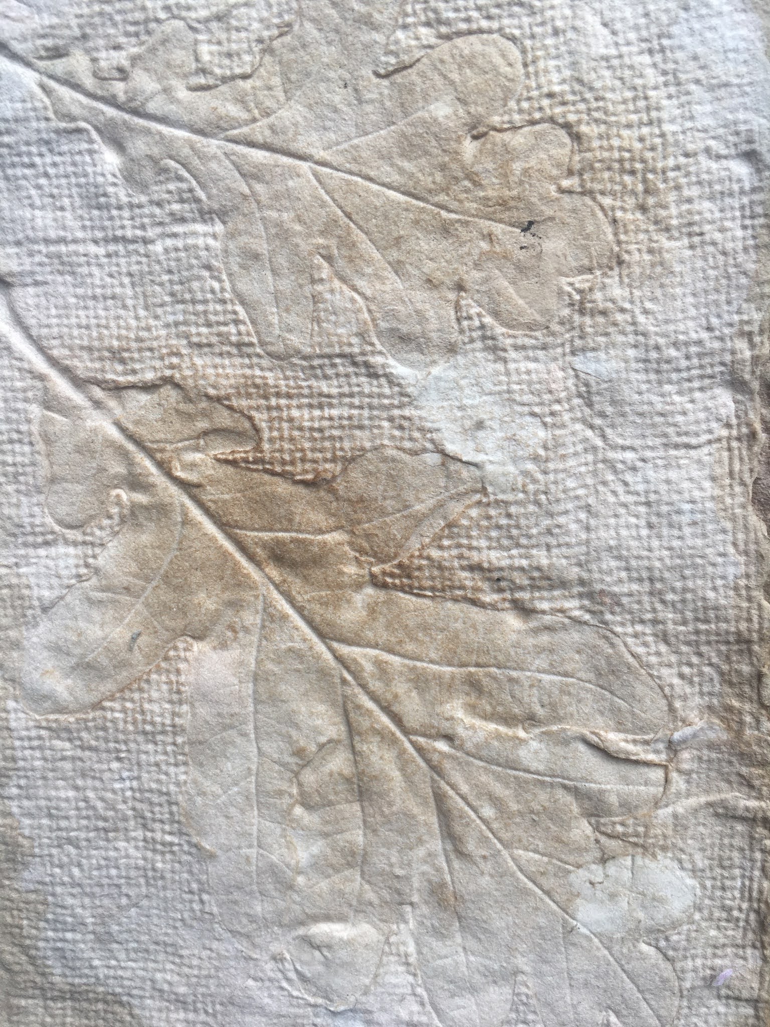
 More hand made paper which has been embossed with a real oak leaf. I'm thrilled with the result!


Here she is probably in her mid twenties:


Her initials embossed in hand made paper:


As a child playing on a swing! Probably a common style of photo at the time. I've added a ribbon sash to embellish the photo a little:


Her wedding day! May 1922. I have embellished her bouquet with some hand stitching [bullion and French knot with detached chain]; I think my Grandfather looks very dapper and proud in his top hat!


Here they are as a family! My mother is in the centre front and she says Grandpa had probably just fed the pigs given the bucket in his hand. I love this relaxed family portrait and would love to know who the photographer was! I sourced the newspaper page from Google images, it was dated 1931 which would have been around the correct date.


Farmer's wife and busy feeding the ducks:


Children playing and running through the farmyard:


Nursing years. I don't have a photo of my Grandmother in her nurse's uniform and this image was sourced from The Red Cross website. The background photo is of the clinic in Exeter hospital  which I've printed onto calico and then added the free machine stitched image of the nurses.


The autograph book has many sincere messages of thanks, poems, drawings,and anecdotes:


These are oak leaf collages made up of monoprinted papers to symbolise the autumn as my Grandmother registered with the Red Cross in October, 1915:


A double page spread clearly showing the soldiers waiting to be seen and the nurses in their splendid uniforms waiting to start work, I've added some monoprinted and text within poppies to add to the atmosphere in the photo:


The later years. My Grandparents as I remember them. I love this photo:


My Grandmother was a very practical and accomplished needlewoman. I love these beautiful calico covered buttons and I'm lucky enough to have a full set! 

I've added text from an embroidery book dated 1939, I've actually got 2 copies so felt ok about using these pieces of text from the pages of the tattiest one! And they're very apt!!


A piece of my Grandmother's embroidery:


And this entry was made by my 11 year old self in her autograph book after she died, I remember feeling very sad. She taught me many proverbs and this is one of them:


And at the back of the book.............. I always like to have a pocket or envelope for odd snippets left from a project and I found this little envelope with a memo to remember inside and that seemed very apt:


A fitting end to the celebration of a wonderful lady and a life well lived..........


Embroidered panel of my Grandmother's experience in WW1 - as it nears completion.

 The embroidered panel is nearly finished, all that remains is stretching the panel over a board in preparation for framing. A box frame I think!


Plus some close ups views:


Thursday, 6 May 2021

Stitched Textile Artists zoom weekend March 2021

The group was led by Textile Artist Sian Martin and our inspiration was to be taken from colour and shape especially those seen in the later works of the artist Henri Matisse.

Sian asked us to send an image from which we would take our own personal inspiration.

I had recently received 3 beautiful bouquets of flowers from my sons and it occurred to me how well the blooms would lend themselves to a study of shape and colour.

A bird's eye view of the first bouquet:


Rose blooms laid on a contrasting tonal paper with added scattered petals from a previous bouquet:


Session One:

We started working with layers or stacks of coloured or printed papers, cutting in a relaxed fashion making simple and not realistic shapes whilst paying attention to colour variants and tone.

I decided upon pink and green variants and contrasts and added a print off of my original image as the top layer: 


We tried different arrangements , sliding the shapes around until we were satisfied whilst paying attention to the importance of negative shapes, interaction of colourways, folded or rolled up edges. These were stuck down when we were happy. I loved the results:


Session two
During the afternoon session we started to work into our collages adding lines to emphasise shapes and flow, reacting to and echoing rather than following. Shadows became important. We echoed our shapes and shadows with lines and added extra contrasting coloured / tonal shapes in different places within the tonal ground. 


I played around with the addition of darker tones, text and stitching:


Follow on zoom session 30.04.21

I had made several samples during the March master class weekend above using stacks of paper of contrasting colours and tonal values. My inspiration came from bouquets of flowers, mainly pink roses sent to me by my two sons. Their gesture was very tender, meaningful and touching.

I wanted now to take my work to a further stage by making some samples using fabric.

I limited my colour scheme to pinks and greens incorporating contrasting hues and tonal shades, choosing to random and dip dye some of my own fabrics and threads to achieve the harmonious and contrasting effects I was after. I used mainly silks.

I used cold water dyes in forest green, peony pink and burlesque red; I used some colours on their own and others combined remembering to add some linen / stranded cotton threads to the mix. In addition I printed my original photograph onto silk using the freezer paper method. I applied Bondaweb to the wrong side of all these to enable me to secure the shapes later. I also added snippets of shocking pink silk plus slithers of text from the boys’ message which I’d typed and then printed onto fine cotton using the freezer paper method.

I cut five A4 pieces of fabric incorporating each colourway and layered them. Out of these I cut 4 rectangles before cutting further to make several arched shapes as before [without being too precious!]

 I arranged these shapes and rearranged until I was happy. I used a brief tap with an iron to fix the shapes.

From top left clockwise:

1. Layers of soft muted tonal shapes applied to a dark pink silk velvet background with the addition of running stitch using the random dyed threads which I feel define the ‘petal’ shapes and give a lovely impression of movement.

2. Layers of shapes with the addition of shocking pink silk which have been bonded to a background of forest green random dyed background. I free machined these into place in a spiral fashion before cutting the piece into a ‘geometric’ spiral and stitched again. Once it was cut I needed a base fabric [tonal contrasting dark green]. I love the liveliness and the 3D effect in this created by the shocking pink and the cutting / re-stitching.

3. Lovely muted layers and threads give a sense of soft depth with the addition of shocking pink which makes it dance and sing! Running stitch adds definition and movement.

4. Muted layers cut spirally and stitched to a dark pink and tonally contrasting pink background.

Snippets of text in all these add an emotional element.

I love all of these from the softness of samples of 1 and 3 but feel drawn to no 2 with it's contrasting colourways and sense of movement.

I’d love to develop this into a larger piece with a pale pink / green random dyed and lightly wadded silk background supporting ‘blooms’ of various sizes and techniques perhaps with continued stitching between each to link shapes somehow.

At this stage I turned to an original drawing by Charles Rennie Mackintosh [source on-line Pinterest] for inspiration:


I played around with cutting into the shapes and love the 3D effect which seems to lift the image from the page:


I therefore set about trying to achieve a connection with flow and movement within the lines and shapes of my work.
To achieve this I experimented with paper first. I made a new stack of papers cutting them as before but with 2 of the rectangles cut at half the size to give smaller blooms. I then arranged and re-arranged the shapes to create a pleasing interaction. The samples were arranged and stuck down as before:


I free machine stitched into the shapes in a spiral fashion:


Now for the moment of truth! Time to cut into the shapes. I decided to print the above 3 times to allow for 3 experiments.

This one is my favourite, I cut sensitively and intuitively into the 'roses' and rearranged the cut shapes to achieve the connection and interaction of shapes I was looking for. Very pleased with this and the sense of movement and depth of the layers.


Another experiment with a different direction of flow but this doesn't create the connection and flow I desire


Third experiment with a geometric spiral arrangement which although fun to do doesn't create the effect I want!

This is my progress so far and the next step will be to recreate the first sample using fabrics.

Translation into fabric:

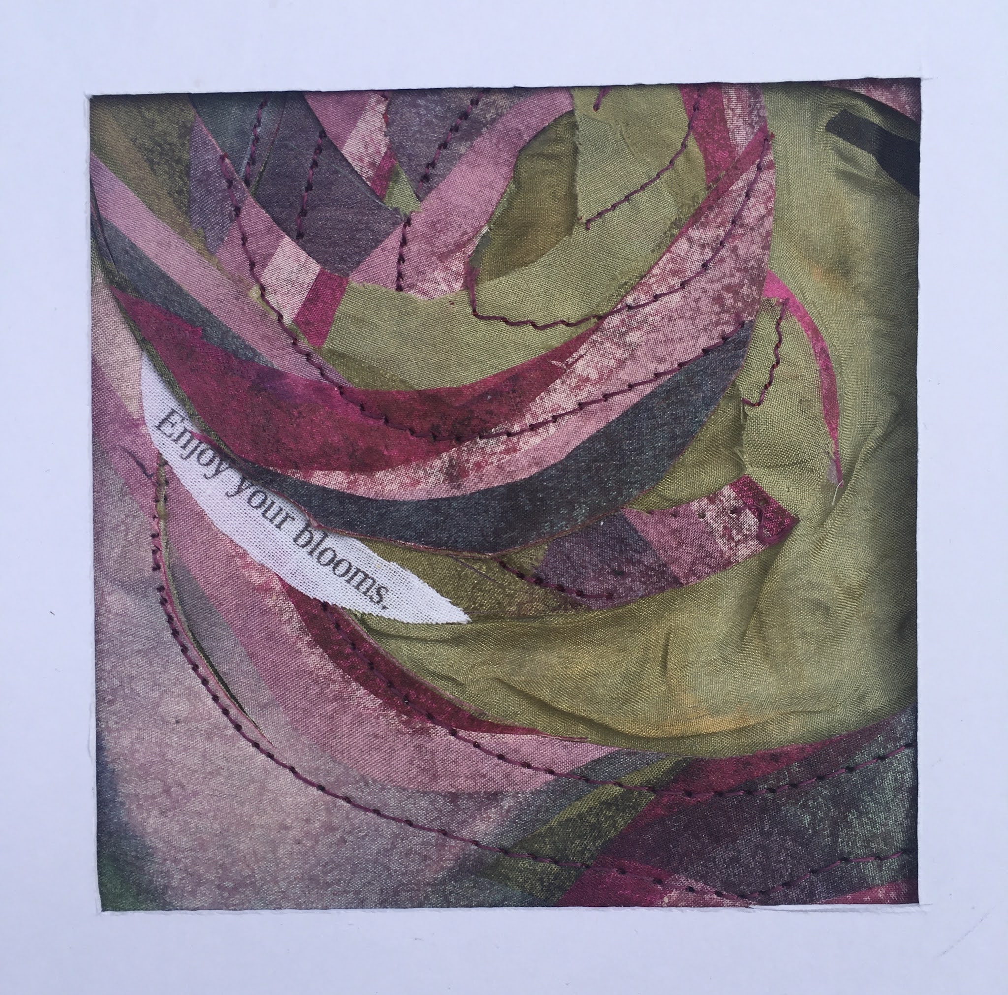
I used some space dyed silks in shades of pink and green to represent my beautiful roses.

Using the same techniques as above my aim was to incorporate the spiral patterns inspired by the Charles Renee Mackintosh drawing and to capture the delicacy of the petals. I also included snippets of text which I'd printed onto a fine white fabric.


Three completed fabric (silk) collages with free machine embroidery  represent the three beautiful bouquets received recently from my sons.

For me fabric and stitch offer the perfect qualities to express an emotional reaction to the world around me and this piece demonstrates that perfectly.

Wednesday, 24 March 2021

The addition of text.

 The oak tree symbolises ENDURANCE AND STRENGTH so these words seemed essential. 

I have added COMPASSION AND CAMARADARIE as two words I feel to be relevant to nursing and  which I feel are portrayed so beautifully by the Red Cross nurses I have embroidered for this piece of work.  Neither of them are my Grandmother but two young women of the same era sourced from the Red Cross website but who would have served in the same way with the same inherent qualities to nurture and care for others. 

Other words which come to mind are COURAGE, FORTITUDE, PATIENCE and GRATITUDE. These are the words most frequently used by the soldiers as they expressed thanks to my Grandmother. 

The words are stitched in free machined straight stitch on a strip of calico which has been carefully measured out as per the diagram below. Sadly I couldn't fit all the words in at present but this is work in progress and will evolve so I'm looking for ways to include these to their best advantage. At the moment I've added patience and gratitude.

Of course it was important to add the date.


This is my work thus far :


I


Chapter 12. The Red Cross

 My Grandmother registered to volunteer with the Red Cross in 1915 [see chapter 2]

I have decided to represent the Red Cross with a repeated simple cross shape composed of a commercial red felt to which I've added  further texture and colour with  painted Bondaweb. I then  drew on past ideas explored in Module One chapter 11 of my Embroidery Certificate to find ways of  presenting the cross shapes.


 I'm impressed by the row of nurses lined up in the clinic background resplendent in their uniforms with aprons displaying the red cross. For this reason I felt this block of the cross shapes creates a pleasing balance in the space adjacent to the clinic setting whilst picking up on the colours throughout the piece especially those featured within the cascade of poppies. At first I felt the cross patterning may be too dark in it's association with death but the Red Cross has such a good strong presence for good that this worry was dispelled. 


  I also have a Red Cross button to place but I feel this may be a later addition depending on composition and balance of the overall result.


Tuesday, 23 March 2021

Chapter 11. The cascade of poppies.

 I wanted to arrange the poppies as a cascade taking in the clinic, the soldiers attending and some of the text taking from my Grandmother's autograph book which contains anecdotes and messages of gratitude towards her. This little book was in use 107 years ago and captures the sentiments and experiences of the soldiers she helped to care for. The photo of the clinic in Exeter captures a moment in time and somehow I wanted to bring these factors together.

I felt this image of the clinic and the soldiers' sentiments somehow needed to be conjoined, I experimented with some reverse applique to cut a poppy shape out of the clinic photo [trying this with paper first] to reveal some of the soldiers' handwriting underneath. I have selected samples of handwriting which are clear and in best condition, I took care to find samples which gave details of the time and place e.g. date and location. I then tried placing the 'cut out' image amongst the poppy cascade. I followed this with poppy shapes taking in oak leaf patterns and more soldiers' handwriting.


I love the cascading effect so familiar to us and representative of remembrance whilst pleasing to the composition.


The next stage was to translate this into fabric:


This detail shows the layering of components - the machine stitched oak leaf pattern beneath the sample of handwriting, the image of the clinic and finally the cascade of poppies. My mother also found the beautiful photo of my Grandmother which sits comfortably amongst the poppies. I have surrounded the reverse applique with red free machine stitched satin stitch [Sian's suggestion - thank you] to represent how devotedly these soldiers were cared for and nurtured. Each poppy is secured with a snap fastener and secured by stitching these to the backing fabric which gives a 3D effect.