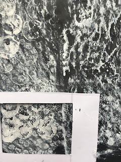
The first step for this chapter was to decorate some papers with flat textures and others with raised textures, these will then be used for cutting up and developing my designs later in the module.
My aim will be to create several design ideas and the select one to take forward into the next chapter for translation into manipulated fabrics and stitchery methods.
The module suggests that we stick with one colour to ensure that the textures remain the main focus.
Although I could bring colour into the process I've decided to stick with white partly because I'm really enjoying working in monochrome but also because I have some gorgeous new threads to use!
I started the process of designing by selecting a few images from my research in ch 1 to inspire ideas for creating marks which would relate to the textures there. I then used these to decorate some papers.
Flat textures
11.1 Printed marks using a range of 'utensils' and white acrylic paint and Quink ink with bleach:
11.2 Rubbings using Neocolor wax pastels and Markel sticks:
11.3 Monoprints using white acrylic paint:
11.4 and 5. Ivy leaf print, I felt this may be a little contrived but I was pleased to see the wonderful abstract shapes within the viewfinder:
11.6 End of cork with added rubbing with Neocolor wax pastel over fossil and hole puncher waste:
11.7 Plus some Quink ink with bleach prints using the side of a piece of cord and
11.8 Quink ink with bleach added by the dragging of a cocktail stick and dried grasses:
Relief textures
To create raised surfaces. I added a skim of white acrylic paint to highlight the texture in most except for those where I may consider using tea to colour fabric and threads later in the next chapter.
11.9 I like to work with sources from nature as much as I can and I enjoyed using these to make some relief textures starting with baked [ for drying] garlic peelings and dried rose petals.
11.10 Dried hollyhock seeds and long grain rice. Baked and sliced onion skins below.
11.11 Straw packaging and dried grasses. I'm particularly pleased with the grasses and the way they created a lovely rhythmic pattern on the paper
11.12 Tissue paper spread and manipulated on the page:
11.13 Baking parchment folded into a concertina and leaf shapes cut out, I've then used the shapes within the remains of the concertina on upper right.
The same methods repeated with the tissue paper middle left.
Bottom left - strips of ripped and twisted corrugated cardboard plus a swathe of sand trapped in PVA on the bottom right: Skim of white paint added.
Whilst referring to my resource photos I looked for simple shapes to see how the images could be sub divided.
I then took one of my flat textured papers [cut to post card size] and drew one of my subdivisions on the back before cutting or tearing along the lines. These were then laid on another piece of [contrasting background] paper and in the correct order with gaps inbetween each to define the divisions.
I had several goes at each image taking notice of the lines in the images inviting division, negative spaces or gaps to look through plus any abstract shapes.
11.14 Ivy roots
I chose a print made using Quink Ink and bleach to represent the roots although you'll notice the image has come out in the reverse but I don't think this matters to much to the design. The divisions have helped create produced a strong image with an impression of movement.
11.15 Cow parsley:
For this I chose a monoprint using white acrylic paint and the end of a wine bottle cork with added rubbings using a white Neocolor pastel crayon and a fossil [brought back by a friend from The Great Barrier Reef] and a sheet of hole puncher waste glued to paper.
I've tried to create the wonderful frothiness of the cow parsley and I can just see it in the subdivided images although I think it is better captured in the Fibonnacci strips on the bottom right
11.16 Ivy, stick and undergrowth
For this I chose the monoprinted leaf prints, I'd though at first that this may be too obvious but I love working the natural sources whenever I can and I really love the abstract shapes and negative spaces produced by this. The top right could be my favourite!
11.17 Teasels
Quink ink and bleach with marks produced with a bottle brush and the swishing of dried leaves from the garden. Beautiful images and another potential favourite
11.18 Ivy clad ditch:
More leaf prints and a stab at colour but I really want to stick with monochrome.
I could clearly see a leaf shape with the source image and would love to try and repeat that in some abstract way.
I'm now looking forward to the next chapter when I'll work on my resolved sample.
I need to choose one design to carry through and so will take a little time to consider carefully bearing in mind the opportunities for fabric manipulation and stitchery.


What wonderfully creative work Carrie! You have enough material and ideas to keep you going for years! I love your inventive use of different materials.
ReplyDelete