These shapes had to appear to follow a pattern, albeit sometimes indefinite. It was, however, important to note qualities of the different rhythmical patterns.
The first stage was to make a collection of decorated papers using the methods covered in the last chapter featuring the colour schemes of my photographs:
Papers blue tones:

Papers red tones:

Papers yellow tones:

I then made simple torn or cut shapes to translate those observed in my photographs and attached them to a background paper.
Following this I tore or cut up the first sample into similar or identical shapes and applied these to a different background.
These were then composed differently and moved around on a further background to create effects more like the sea or sky or to produce an interesting variation on the original.
I have uploaded my sketchbook pages with all the details of the processes involved but because the quality of the printing is poor I have added the photographs of each stage here too
Sample 1 Waves


1a

1b. I'm really pleased with this final collage as it really seems to portray the rhythm and swelling of the waves.

Sample 2 Ripples


2a

2b

2c Final piece
I cut this a third time having been to my weekly swim and noticed the complexity of ripple reflections in the water so cut it further!

Sample 3 Yellow morning sky


3a

3b

3c I decided to cut this sample up into squares to try and demonstrate the random patterning in the sky:

3d And then I re-arranged the squares to represent the changing patterns of the morning sky:

Sample 4 Red sunrise

4a

4b

4c Cut into vertical strips for final collage

Sample 5 John Constable Rainstorm over the sea.

5a

5b Dark and moody sea and sky

Sample 6 Turner. Sea and sky English coast


6a

6b Much more movement after the second cutting and re-arrangement of papers:

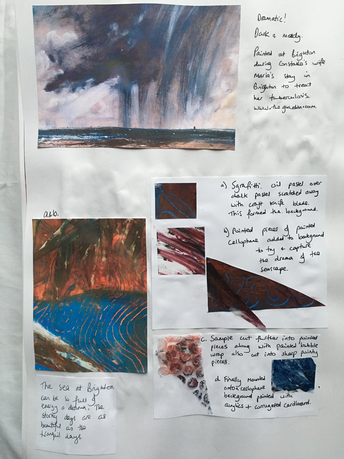
Sample 7 John Constable The coast at Brighton:

7a

7b

7c I decided to tear horizontally to emphasise the horizon and to bring the heavy clouds forward and over the sea:

Sample 8 Brighton sea and sky. For this sample part of the brief was to mount the papers onto foil.

8a

8a

8b

Sample 9 Icy puddle - Iceland


9a Frottage method worked on tin foil:

9b

9c

9d I felt the previous sample looked a bit boring so cut around some of the upper shapes to break it up a bit and to represent the crackled ice patterns.

This completes chapter 2, I worked a lot of samples and got a bit carried away! It was fun and fascinating to develop lots of interesting effects.
The following samples are some worked for previous work but are relevant to the sea and sky topic so I felt I'd like to include it here.

Sea and sky worked with a monoprint torn in strips over the sea:

Monoprint and printing with edge of a credit card to depict the West Pier:

Artwork torn into strips and rearranged to show the demise of our beautiful West Pier as it surrenders to the mercy of the waves.


No comments:
Post a Comment